UX DESIGN
Redesigning Garanti BBVA Bank’s Personal Loan Application Experience
Project Goal
How might we redesign Garanti BBVA Bank's personal loan application experience to be delightful, seamless, and human-centric?
This project's goal was to analyze the user funnels, improve the barriers to application and design a human-centric, user-friendly experience for key target audiences of Garanti BBVA Bank; Turkey’s most valuable and second largest private bank.
Company
Role
Senior UX Designer
Project Team
Worked together with another senior UX designer and business analysts
Brief
Discover the UX problems and redesign Garanti BBVA Bank’s online personal loan application experience from the ground up
Challenge Framing
Garanti BBVA ranked at the top of Google search results, with excellent SEO rankings and a high marketing budget spent on SEM for the ‘loan’ keyword and its derivatives. So the visitor number was high, but the conversion rates were lower than the target numbers.
So we framed the challenge as figuring out UX problems that affected low conversion rates, removing the frictions to loan applications, and designing user-friendly solutions to improve and optimize the experience.
Another big challenge was that we only had 6 weeks to deliver this project, so we made trade-off decisions in our design process to fit this time constraint.
Project Outputs
Qualitative & Quantitative UX research
4 User Personas
User flows
Paper prototypes
UX wireframes and click-through prototypes
‘Guerilla’ Usertests and design iteration
Our Design Process
1. Discovery Phase
We conducted stakeholder interviews and held workshops with product owners, and business and technical teams responsible for building the loan application experience to frame the project.


For UX research, we mapped as-is user journeys on the website and analyzed quantitative data such as web analytics and user funnels, and qualitative data such as user research and industry reports, customer tickets online user reviews.
2. Synthesis Phase
We identified the key user flow and information architecture problems; such as the exact screens and modules where the user was lost or leaving the website.
We defined 4 new Loaner Personas; detailed their needs, motivations, and pain points. With stakeholders, we strategized on how to meet the needs of our personas. Our hypothesis was that the redesign had to cater to all 4 personas in different aspects and moments of the journey.

Persona 1. The Researcher
“Comparing all the offers, I see that interest rates are the same, but repayment amounts are different.”
Persona 2. The Loyal
“I know Garanti’s system already. Why would I go on an adventure and apply from another bank?“
Persona 3. The Deal Chaser
“I don’t need to check the fees. I take it to the consumer court and get it back anyways.“
Persona 4. The Utilitarian
“I already receive my salary at Garanti. Therefore, my loan application is going to be approved super-fast.“
3. Ideate & Prototype Phase
In the first cycle of low-fidelity prototyping, we designed paper website modules and held co-creation workshops with users and stakeholders.
After key decisions, we went into high-fidelity prototyping: We designed the wireframes for all the screens in the experience journey, connected in a click-through UX prototype in Adobe XD.

4. Guerilla User Tests & Iteration Phase
The initial project scope didn’t include any user testing, due to the tight deadline. But I championed running “Guerilla User Tests”; which are quick and informal ways to test products and get high-level feedback from users.
We tested and iterated our designs with users that fit our 4 personas in the office; ranging from security guards to white-collar colleagues, from cooks at the dining hall to young interns.
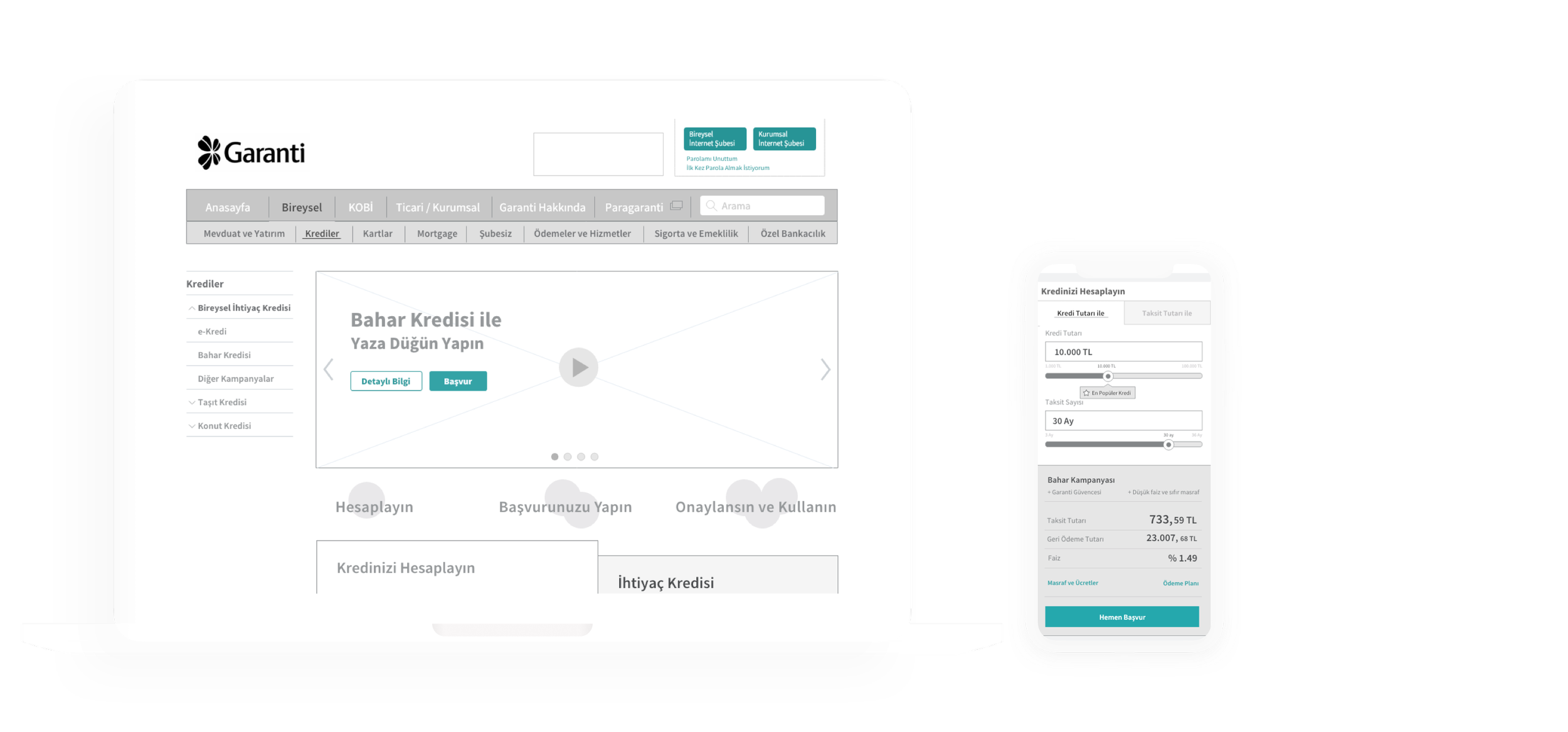
THE SOLUTION
The new personal loan experience has a brand new “loan calculator” and many other human-centered solutions based on user insights and data analysis.
-
![]()
Calculator redesign with brand new components
-
![]()
Conversational, relatable, authentic, and user-friendly UX copy
-
![]()
Tab systems for easy and compact access to primary information that the customer and non-customers are looking for
-
![]()
Personalized calculator experience that showcases the latest campaigns and special rates
-
![]()
Customer testimonial modules


